For this prototype I decided to make the prologue in Ren’py to see how it would work/flow. The feedback I’m looking for is if the the font and text color fits the written text and the background. Currently, I’m working on the character sprites on the tablet I got recently so I don’t have them ready at the moment. Also the backgrounds are just slightly modified, temporary stock images. However, here are some screenshots I have of it:
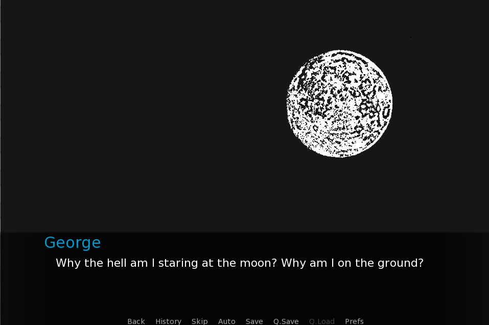
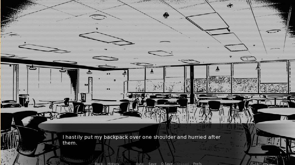
I really like your designs because your art style is cool, unique, and consistent between both images. I like how the text is in the same spot for both images so the reader does not have to search for the text when going from one page to another. The text is also easy to read as white text on a black background allows for the text to pop out. I also like the TV scan lines effect in the second image because it adds to the atmosphere of the story and art style. The menu is also in a good place and easily seen as it is near the story text.
I am sure you know more about this than I do, but I noticed that the black background of the first image is slightly different than the black background of the text box. Just something that I noticed as this detail may be a good addition to a glitchy art style.
This looks pretty good! I think the font is pretty readable, and it doesn’t clash with the backgrounds at all. It definitely looks professional enough that I could imagine it being in a real, polished game. While the backgrounds right now are just temporary stock images, if your final backgrounds look anything like they do, I think they’ll look pretty interesting. I like the horizontal bands on top of the second one – it almost reminds me of looking through an old TV or security camera screen.
There are a couple of things that I’m wondering about, though. I notice that the text in the menu on the bottom is bigger in the first image than it is in the second image. Was this because of how you cropped the screenshots, or is it because of programming within the game itself? If it’s the former, that’s fine, but if it’s the latter, then you might want to make sure that the menu is being displayed at the same size all throughout the game.
Also, would most people who play this game know what “Auto”, “Q.Save” and “Q.Load” mean? I’m not much of a gamer, so I don’t know how common those terms are, but I’ve never seen them before and wasn’t sure what they meant.
I like the art style that you are aiming towards, as I read from the script its interesting to see how that tones can be reflected from these screenshots. The UI might need some tweaking at it would be much more efficient to have fewer options as default. But if you wanted to include more option you could have one of the options as a slide up that when hovered or pressed will show like other options on top of it. Just make sure with each scene that there is consistency in text size and font.
Hi Aaron!
I absolutely love the second photo and think the text and font style work really well. However, the first one threw me off a bit. I had a problem with the “George”– maybe the color threw me off or the font in a larger size looks weird to me. If you’re going with a black and white theme, maybe just keep the font white, but may I also suggest making the text color of the name a blood red (since that will match the story line you have).
Also, maybe add some lighting effects to the moon to make it look more like he’s looking at it from the floor.
Aesthetically, I quite like it, even though I’m not a fan of visual novels generally speaking. I know you said the assets right now are just temporary placeholders, but I hope the actual final product keeps this sketchy, monochrome style. It feels pretty distinct.
I’d change the font, though, the text looks pretty generic– it doesn’t fit the stylization of the imagery, you know?