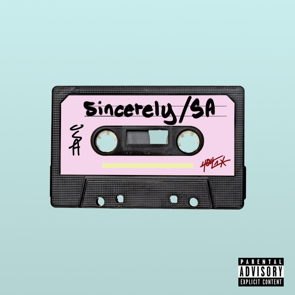
For prototype 3 I am showing off the first draft of the cover art for sincerely. It was inspired by a few of Kanye West’s and Post Malone’s album covers. I wanted to take the same minimal approach to this as the previously mentioned artists. However, instead of using a CD/Vinyl for the cover, I decided to use a cassette tape for the cover inspired by the research component of the senior thesis. Since I am calling my project a mixtape I wanted the visuals to be representative of this decision.
Another Draft we might work on is instead of using pink for the mixtape, we would replace it with photos of me taken over the past few years.
The questions I am asking the class are:
– Is the minimal aesthetic good or should there be more?
– Should we attempt to replace the pink of the cassette?
– Could you see this being used as the final draft?
I like the minimal aesthetic to this album cover, whether changed to pictures of you or add more is up to you. Like you explained in this post, it is suppose to be a representation of a mixtape and “wanted the visuals to be representative of this decision.” You can look into changing the pink to mix with the background green as it does sharply contrast it. The minimal aesthetic is a process towards a final draft just look into whether you would like to change the pink to pictures or a different tone of pink.
Minimalism can be a great way to make cover art that people remember. I definitely like this prototype, and I especially like the color choices you used. I like how the title is incorporated into the album art itself rather than being superimposed on top of it. I personally think that the pink is fine, but including photos of yourself could still be an interesting design choice. If you decide to replace the pink, be sure to dramatically lower the contrast of the photos of you, that way the title and handwriting are still visible on the cover without it being too cluttered. It’s definitely something to experiment with.
Hi Alex, looks great! – To your questions…
Is the minimal aesthetic good or should there be more?
-I really like the minimal aesthetic. If anything, the font of the “Sincerely/SA” threw me off the vibe a bit. Maybe making the text size smaller or trying a different font?
Should we attempt to replace the pink of the cassette?
-I really love the pink of the cassette tape. It’s a nice contrast to the blue and gives off a olden days retro diner vibe!
Could you see this being used as the final draft?
– I think this is definitely a great first draft! Depending on your style of music, I would add more to the tape, i.e. a bit of rust, or shine, etc. You could also play around with different colors. To me right now the feel is at a retro diner, but the music you played last class was more day-dreamy, walking in a meadow themed. Again, depending on the music style you’re focusing on will help you with focusing the design.
I really like your cassette design on the album cover. It is very colorful and evokes a musical and creative mood. I have seen artists use more art on their album covers and less both successfully. As it is, I think your album art is very good. If you wanted to add more to it, then I think putting some kind of design in the light blue background could help, or designs or images that represent certain songs or the overall theme of the mixtape. The colors you chose also contrast nicely and make everything clear to see and read. When I see this album cover, I definitely think of hip hop and rap, which is great for this mixtape’s genre
I really like your cassette design on the album cover. It is very colorful and evokes a musical and creative mood. I have seen artists use more art on their album covers and less both successfully. As it is, I think your album art is very good. If you wanted to add more to it, then I think putting some kind of design in the light blue background could help, or designs or images that represent certain songs or the overall theme of the mixtape. The colors you chose also contrast nicely and make everything clear to see and read. When I see this album cover, I definitely think of hip hop and rap, which is great for this mixtape’s genre.